
“The printing trade is barred to women, on the craftsman level”, crackles the voice of Beatrice Warde in a radio interview recorded in Australia in 1959, “and that’s been true for many centuries.”
Indeed, until recently the history of women in typography can be read as a story of feet in the door and cross-dressing — or “transvestism”, as it was named by the authorities of the time, forbidding a person from appearing in public “in a dress not belonging to his or her sex.” 1
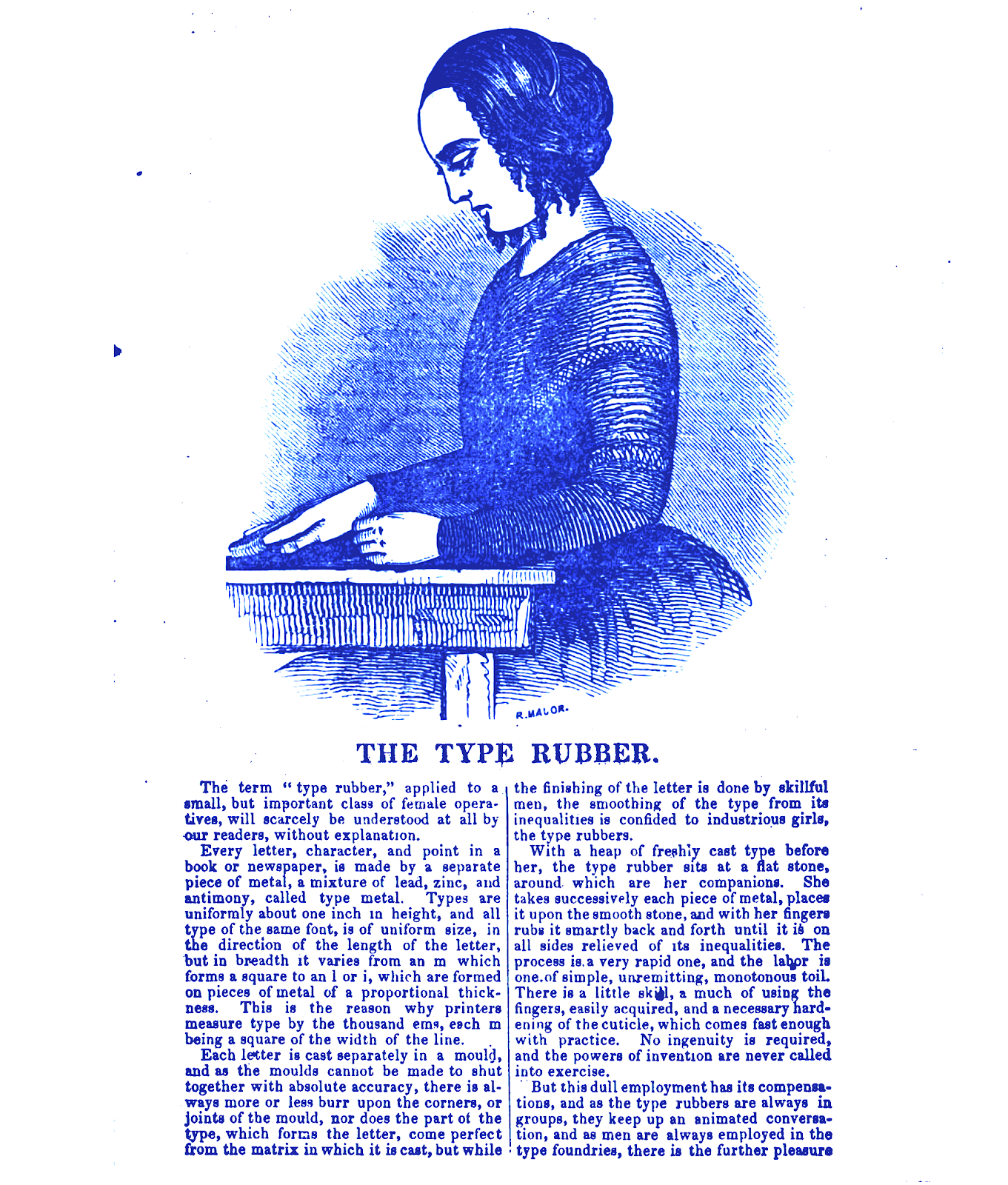
Since the beginning of the industry, western typography has always been a very gendered field, dominated and designed by white men. From the time of the creation of the first lead characters for the printing press, the printing trade in Europe serves a conception of typography that we still know today 2. In it, women were mostly absent, invisible or accepted only in specific roles: to clean the metal fonts from the printing ink and to sort them. This imbalance concerns particularly type design, but also typesetting (composing the layout), and the whole trade of bookmaking, where women could only be found associated to activities like binding, probably because it involves thread and needles 3.
In this history, only rare exceptions made it through, sometimes literally disguising themselves.
Beatrice Warde starts working as a librarian in a company specialized in typography (American Type Founders). Since research in typography was also a field that women couldn’t access, she enters through the back door, literally under-cover, in the role of a librarian — a role more easily accessible for women. She is then able to do research in between the book racks, and eventually she ends up with a whole research paper on the origins of the Garamond typeface. In this paper, she reveals that the creator of many of these characters was not Garamond but another person, Jean Jannon, whose name didn’t remain throughout history and whose typeface was misattributed to Claude Garamond.
Unsure about the legitimacy of her paper if it were to be openly credited to a woman author, Beatrice publishes it in the journal The Fleuron under the male pen-name Paul Beaujon. Their paper is acclaimed, and in 1927 Paul Beaujon receives an invitation for a job interview at Monotype, where Beatrice shows up as herself. Despite their surprise, she is hired as editor of the Monotype Recorder and type advisor.

At Monotype, Beatrice Warde gains legitimacy, until it seems she also hits a crystal ceiling of sorts. In 1930, she gives a conference at the British Typographer’s Guild in the St Bride Institute in London, entitled “Printing should be invisible”, in which she embraces the modernist narrative of a transparent and neutral graphic design. Very quickly her speech gets published in The British & Colonial 4 Printer & Stationer, and it is then re-published several times between 1932 and 1937 under the title “The Crystal Goblet, or printing should be invisible”. In her essay, Beatrice encourages graphic designers to adopt a “transparent and invisible” way of working, not “shouting”, as she puts it. “Type well used is invisible as type”, she says, “just as the perfect talking voice is the unnoticed vehicle for the transmission of words, ideas.” It is the position imposed on women in the whole history of typography. If she asks the designer to be invisible, one can’t help but notice the parallels to her early career, where she could only succeed by hiding her identity. Did Beatrice Ward ever really leave Paul Beaujon behind?
Later in her career, she publicly says that while she is convinced that “anyone who has a good sense of design can make the grade if they know their stuff — whether he or she is a man or a woman” 5, she also stated that “the printing trade is barred for women, on the crafts level”. Those words, among the earliest examples which acknowledge the position and absence of women in this trade, are recordings from an Australian radio interview conducted in 1959. The tape remained buried in the archives of the St Bride Library until it was found and transcribed by Belgian graphic designer Sara de Bondt in 2012 6.
The text “The Crystal Goblet” has since become one of the rare texts that are written by a woman and recognised and integrated into the canons of the history of typography. Not surprisingly, her thoughts on the absence of women in the trade didn’t have much resonance…
With new technologies for typesetting and then type design itself, the presence and visibility of women changes. In the mid-20th Century, the jargon coming with new typesetting tools like perforated tape-programmed Linotype machines includes using “a girl” for the typesetting, which meant an inexpensive unwaged worker, as explained in the recent documentary Graphic Means by Briar Levit.
The brain is always an issue (women can not pretend to be creative enough to be authors, neither type designers 7), and the body of course too (women are too weak to operate the machines, “not suitable” 8, their dresses also probably too complicated for standing work in a workshop 9). With the development of electronic media, of more practical clothing regulations and of women’s place in public spheres, women were more “present” and visible in the offices, and their (bodily) position evolves. As Ellen Lupton says,
“Office tasks known as ‘women’s work’ often involve mediating technologies. From answering phones, transferring calls, and taking messages to typing letters and making copies, female office workers historically have formed a human link between managers and machines; women have served as bodily extensions for communications equipment.” 10
That is until digital typeface appear. Since many established type designers have been slow to embrace or even hostile towards these new technologies of making fonts, women finally have the opportunity to enter the field of type design, and simultaneously become pioneers. The most famous designers of this time are Susan Kare, type and icon designer for the first Apple Macintosh, Carol Twombly, who co-designed the font Myriad, Virginia Howlett, designer of the font Verdana, Zuzana Licko, co-founder of one of the first independent digital type foundry named Emigre and type designer, Muriel Cooper, with pioneer electronic “typographic landscapes” at MIT’s Media Lab she founded in 1975.

Emigre is a name that refers to the migrant backgrounds of its founders and could be the starting point of other underexposed stories of typography, particularly that of its connection to Western colonialism. Still today, the technology of typography and electronic communication in general facilitates and favours the Latin script above all others 11. Zuzana Licko, Emigre’s co-founder, moves with her Czech family to the United States at the age of 3. She learns visual communication and typography, but being left-handed she hates the courses of calligraphy. One of the first typefaces she draws is a Greek font, and in 1984 she founds one of the first experimental digital type foundries, Emigre Graphics.

One of her most famous fonts is Mrs. Eaves, a revival of the 18th century Baskerville typeface, which as indicated on the Emigre website “was named after Baskerville’s live-in housekeeper, Sarah Eaves, whom he later married”. Other sources say she was also his working partner 12. The fact that when her partner John Baskerville died, Sarah Eaves took the management of the printing press for ten years suggests as much.
Today, there is still a fight for groups of people who are marginalised through class, race, or gender or an intersection thereof, to become more visible in this field of type design, their work valued and (properly) remunerated, and their histories acknowledged. With the recent development of new ways of making fonts (open-source, collaborative, solidarity-based practices) new possibilities arise, with hopefully new stories to be written.


Notes:
- https://www.dukeupress.edu/arresting-dress
- The printing industry brings a typographic standardization (as opposed to the manuscripts’ handwritten letters which vary, even subtly, from one letter to another) and a separation of the book’s craft into different trades. The printing trade also develops at the same period as the notion of Author, which normalizes the identity of who could pretend to be a creator. Before that period, writing and making books could be performed by women, as attest many representations and signatures (Sister Guda, Jeanne de Montbaston, …) and in the 15th Century, Christine de Pisan starts her own scriptorium, with an all-women team of co-workers, and she writes Le Livre de la Cité des dames — a history of women in her time.
- “Women, where employed at all, were relegated to certain low-paying jobs considered best suited for the weaker sex, such as dressing (polishing imperfections) from metal type, folding printed sheets, and sewing bindings.”, Unseen Hands, Women Printers, Binders & Book Designers, Princeton University Library, 2003, http://libweb2.princeton.edu/rbsc2/ga/unseenhands/printers/walltxt.html
- The colonial dimension which appears here isn’t a coincidence: that type of discourse is in line with those on the universalism of selected design forms that are still very much highlighted today. Read the article from Jen Wong, « Now You See It: Helvetica, Modernism and the Status Quo of Design » https://www.lokidesign.net/journal/2018/5/14/now-you-see-it-helvetica-modernism-and-the-status-quo-of-design
- A double-edged argument, constantly used by conservative discourses to validate the discrimination of representations (under the guise of lack of quality), without taking into account the conditions of access or the construction of these “quality” criteria, as Linda Nochlin analyzed in 1971 in her article “Why Have There Been No Great Women Artists?”
- http://www.eyemagazine.com/feature/article/beatrice-warde-manners-and-type
- See also the great book How to Suppress Women’s Writing by Joanna Russ, 1983.
- “Messy History vs. Neat History: Toward an Expanded View of Women in Graphic Design”, Martha Scotford, 1994, in Graphic Design: History in the Writing (1983-2011), Sara De Bondt, Catherine de Smet (eds.), Occasional Papers, 2012, p.142
- A woman wearing trousers was at the time considered as transvestism, a practice prohibited in several countries. On that topic, Tiphaine Kazi-Tani recommended me Christine Bard’s article, « Le « DB58 » aux Archives de la Préfecture de Police », about a female printer arrested for wearing trousers. Published in Clio, Histoire, femmes et sociétés, 10, 1999 https://journals.openedition.org/clio/258
- Ellen Lupton, Women Graphic Designers — A survey of woman designers of books, magazines, activist campaigns, identities etc. across the 20th century.
- See Nadine Chahine’s lectures, Osmond Tshuma and Rana Abou Rjeily’s works and the website http://www.decolonisingdesign.com
- http://www.alain.les-hurtig.org/baskerville/baskerville3.html recommended by Louis Garrido.
This text was originally written in French for a presentation during the workshop Bye-Bye Binary, on inclusive and gender-fluid typographic experiments, in December 2018 in Brussels at RoSa, feminist library and documentation center.
Loraine Furter is a graphic designer, teacher and researcher based in Brussels, specialized in editorial design, hybrid publishing and intersectional xfeminism. She is part of the cyberfeminist collective Just for the record. Since 2017, Loraine is working on a research project entitled Speaking Volumes — art, activism and feminist publishing, for which recently got a funded PhD position in ARIA/Sint Lucas Antwerp in September 2019.